The global Point-of-Sale (POS) market is currently undergoing a massive transformation. Driven by a surge in retail and hospitality digitization, the industry is projected to…
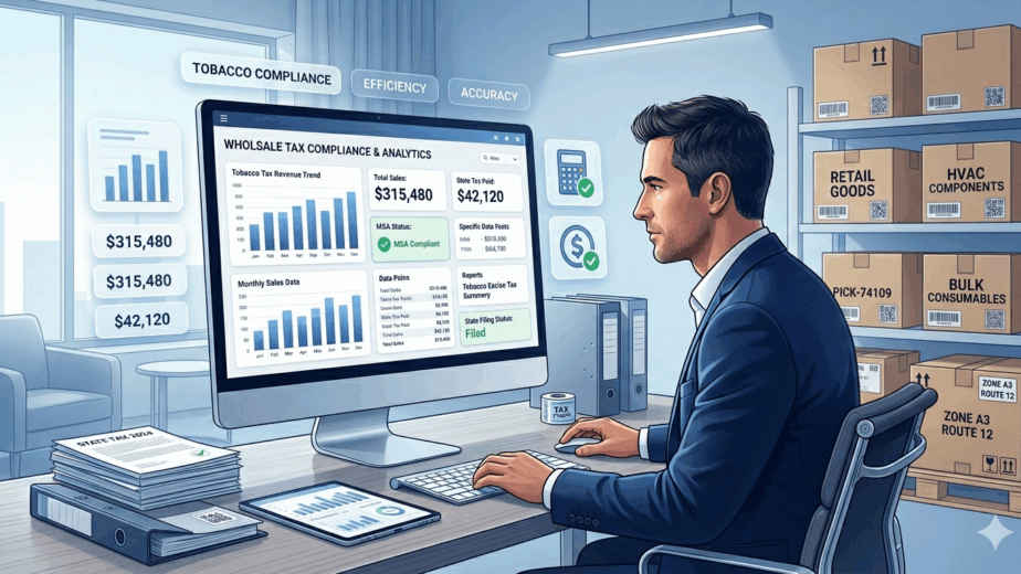
In the wholesale world, margins are tight, regulations are strict, and time is always in short supply. If you’re in the tobacco business, or any industry where compliance…
Imagine this: a line of frustrated customers snaking out the door, your best-selling product out of stock again, and you're still trying to decipher last week's sales reports. Sound…
Did you know that the wholesale industry contributes trillions of dollars to the global economy? To stay competitive in such a high-stakes sector, wholesalers must prioritize…
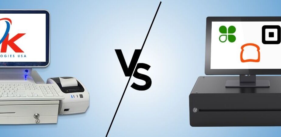
When choosing a POS system, it's essential to consider your specific business needs and budget. With big names like Clover, Square, and Toast dominating the…
[vc_row][vc_column width="1/6"][/vc_column][vc_column width="2/3"][vc_column_text]Building a website for the first time can be both exciting and daunting. One of the most critical decisions you'll make is choosing…
