In the age of smartphones and instant gratification, businesses must adapt to the digital space or risk being left behind. For bakeries, this digital transformation…
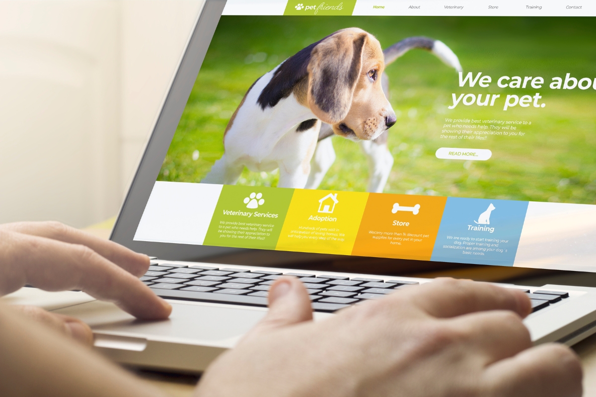
Your pet grooming business deserves a digital presence that’s as well-groomed as the furry clients you serve. A responsive website not only attracts new customers…
User interactions with websites have drastically transformed in the last five years, notably marked by the widespread use of voice commands for online searches. This…
In this fast-paced world where smartphones and tablets are our constant companions, having a responsive web design has become an essential part of the digital…
In today's fast-paced digital world, your website serves as the virtual front door of your business. When potential customers visit your site, their first impression…
